Measuring outcomes – rather than outputs – is a key focus for agencies across all levels of government. To get greater return on investment for the community, we really need to understand the impact of our efforts. Measuring outcomes will provide evidence of that impact.
There are four essential steps in measuring outcomes in government (or any organisation for that matter). This article will show you what those four steps are.
1. Articulate your Outcomes so that they are measurable
Too often we try to figure out measures for things that are not measurable.
This leads us into all sorts of problem areas where we come up with vague ideas, select data items as measures, or worse look at actions as being evidence that an outcome is achieved.
One of the key principles behind trying to get to outcomes is to move away from inputs and outputs. We need to understand the impact of all these things we are doing so that we can be more deliberate in our efforts and ensure we learn about what works and what doesn’t.
Vague ideals or strategy that is ‘fluffy’ is not measurable, so don’t try to measure it. First work out what to measure.
With projects, actions and outputs – we can measure that they are done, or have some outputs as evidence that something has happened, but this does not measure the impact of the effort. The outcome or result that we achieved.
Within Step 2 of the PuMP Method (Performance Measurement Process, developed by Stacey Barr), we work through a five-step process to move from the vague or action-oriented idea to the outcome we want. This is called the Measurability Test, and from this we then map the performance results to understand the relationships.
This technique is profound in its simplicity. Ask, “What is the outcome or result we would expect to see from the action, project, or even when the vague strategy is delivered…?”
For example:
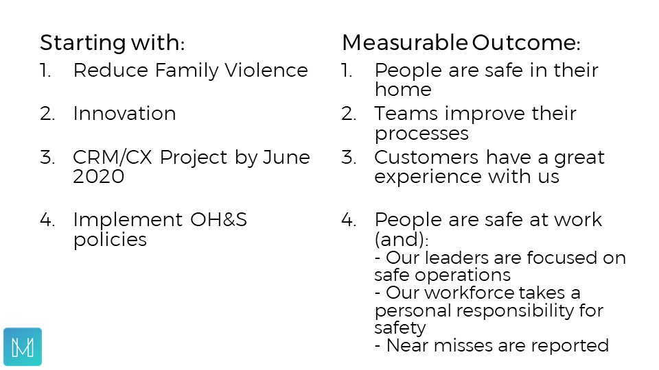
These outcomes or results on the right-hand side are measurable.
2. Map the relationships between the Outcomes, create the framework.
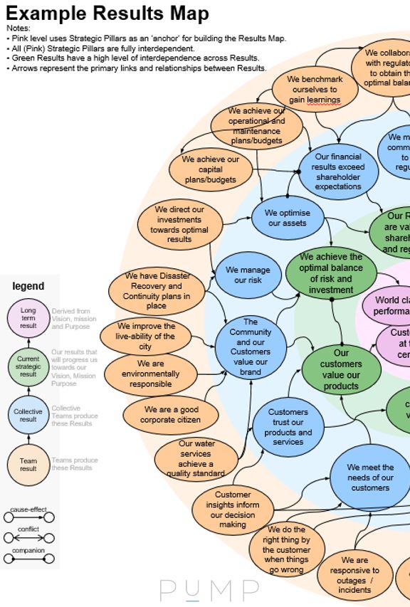
Once we have our list of outcomes or results, we then need to understand how they all fit together.
Often when we plan, we conduct the process with sections or teams coming up with their part of the plan, and then cross our fingers that it all comes together. The problem is that we never really look at the interdependencies of these various sections or teams, until later when we start to realise one team is winning at the cost of another.
From an organisational perspective we need to understand these relationships.
I have found the best method for this is a causal results map -also within Step 2 of the PuMP Method.
The main relationship is causal. With the outcomes of teams flowing in a cause-and-effect manner into the centre of the map, where the outcomes or results derived from the mission/vision are.
All efforts need to progress us closer and closer towards realising our mission/vision.
Mapping the relationships between these outcomes will provide us with a framework. A framework (later) for measurement, and a framework to understand what performance is doing and what is causing that level of performance.
You can read more about Results Mapping in this article
Let’s now see how to design measures for these outcomes, or results.
3. Design and Select quantifiable measures that provide meaningful feedback about your Outcomes
Now we know what we want to measure – the outcome – now we can put some effort into designing and selecting the most meaningful measures for that outcome, or result.
The job of a performance measure is to give us feedback on the result we are wanting to make progress towards. Are our efforts moving us towards our result, or not…? The signals will be in the measures we select for our Result.
PuMP provides a five-step process to ensure we design and select meaningful measures for our Outcome/Result.
Starting with the outcome we brainstorm what the result would look like when we achieve it, when it is real. This brainstorm collects all the sensory descriptors of what our world is like when we achieve the result. Whatever is observable, is measurable. Therefore, let’s make it observable first.
Then from this sensory list we can derive ideas for measures. The PuMP Measure Design technique then gets us to assess each of these potential measures, firstly in terms its strength in providing feedback for the Result. Then in terms of the feasibility of getting the data to produce the performance measure.
The output from this technique is that we have a small number (2-4) of measures for each outcome. These measures are given a name (each measure needs to be identified with its own name), and a description. The description of the measure will read like a formula for the calculation.
For example, for each Result or Outcome, we have this: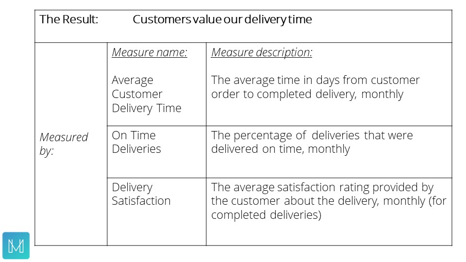
4. Track the progress of your measures in XmR charts and make deliberate decisions about targets.
XmR charts (also called control charts), have been used in the total quality management and continuous improvement movements for many decades. They are based on the work of (Doctor’s) Walter Shewhart, W. Edwards Deming and more recently Donald Wheeler.
Here is a quick overview of an XmR chart.

When we use XmR charts we can see the pattern that the measure value is producing. We see the pattern of performance and the natural variation it creates.
We set targets in two ways, (1) on the central line and also perhaps on (2) reducing the amount of natural variation. When we use XmR charts we get more deliberate about how we set targets.
Firstly, we will only set targets once we know what performance is doing.
Secondly, we will select specific areas of performance where we want to see improvement, a change to current performance. This means we are prioritising where we are setting the targets. More deliberate and informed target setting. We can also of course set targets where we want to maintain a standard of performance.
Our XmR charts then are used in our dashboards, for example.
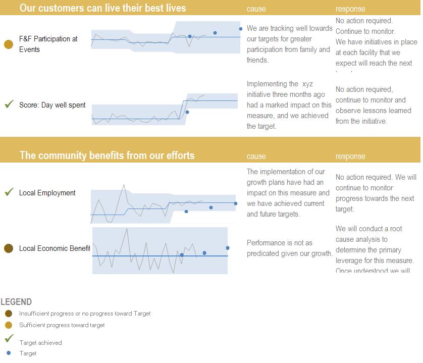
(This dashboard mock-up was developed using the template created by Stacey Barr and provided to participants of the Performance Measure Blueprint Workshop.)
With a dashboard like this, our focus is on the Outcomes. The measures are providing feedback on the outcomes. Our targets are demonstrating where we are putting effort into the business to gain the performance improvement we are looking for.
With a dashboard like this we can see what performance is doing, why it is doing that and what to do next (if anything), clearly.
Summary
As we have seen there are four key steps to measuring outcomes in government.
- Articulate your Outcomes so that they are measurable.
- Map the relationships between the Outcomes, create the framework.
- Design and Select quantifiable measures that provide meaningful feedback about your Outcomes.
- Track the progress of your measures in XmR charts and make deliberate decisions about targets.
Follow these four steps and you will be able to measure the outcomes you seek. You will also be able to understand which initiatives are having the biggest impact on the outcome.
Further resources available to you:
These four steps use techniques from the PuMP method and you can learn more about PuMP on this page.
You can also access The Eight Steps to a High Performance Organisation blog article or whitepaper here.
If you would like to learn more about the two-day MasterClass on Measuring Outcomes in Government, you can download a PDF with details covering the agenda and the key takeaways here.
Photo Credit:
Featured Image by Isaac Smith on Unsplash
