

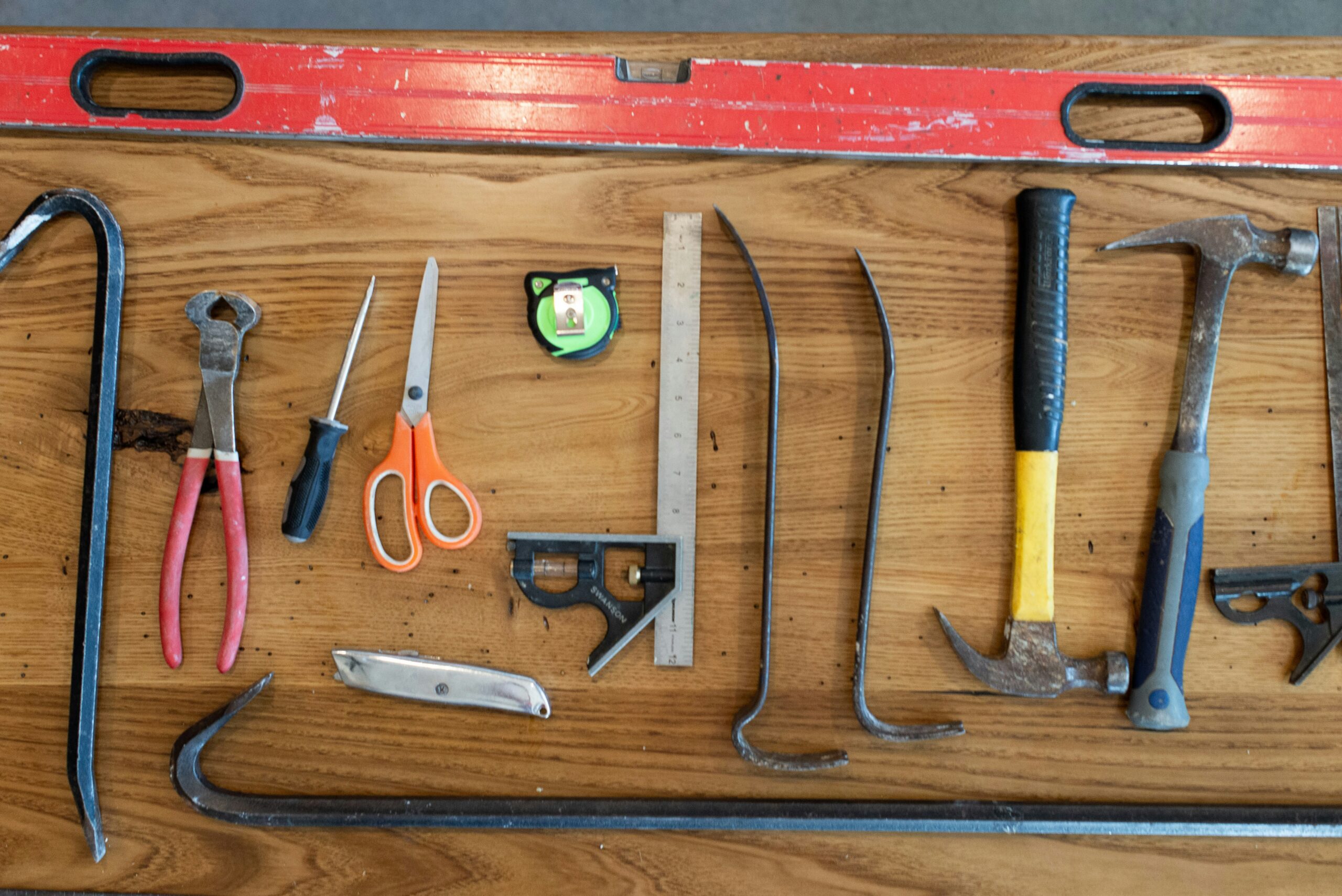
Use the right tool for the right job.
This article dives into the various types of measures and what they are best used for. Use the right KPI tool for the right job.
Then, the best tool to monitor performance over time. Also, the best tools to use to help you set meaningful targets.
Ever used the wrong tool to fix something only to find the problem got worse. As an accidental handyman, it’s happened to me more times than I care to acknowledge… And, after recently completing a guitar making course, the principle of using the right tool for the right task is dominant.
Same principle applies when it comes to the tools we use in the design and selection of your KPIs (key performance indicators). And the tools we use to monitor performance over time, and how we set targets.
There are four types of KPIs.
Four tools for the job or measuring.
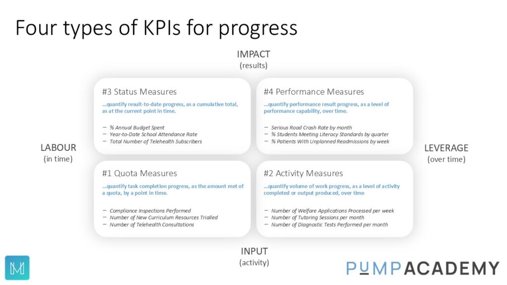
We can see from the image above that there are four ways of measuring progress.
This can be Quota measures that typically track the number of things done over time.
Or Activity measures – those that quantify the “stuff” that is getting done.
Or Status measures, giving us the status, for example, of the spend of capital budget.
Then there are Performance Measures. These are quantifications of an attribute of a performance result (or outcome) over time. These types of measures tell us the impact our activity is having on a performance result (or outcome).
Within the PuMP Method there is a specific technique/tool to design and select the most meaningful performance measures for the outcome.
Now let’s put these tools into a context for us.
Let’s use a project as an example…
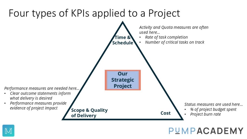
Illustrating a project as a triangle, representing the tension between (a) Cost (b) Time/Schedule and(c) Scope and Quality of project delivery.
As a project manager we need Status, Quota and Activity measures to monitor time, schedule and costs.
But we also need, clear outcome statements to inform what scope and delivery is desired.
Then we need to design and select performance measures to provide evidence of project impact on those outcomes.
Using the PuMP Academy techniques, we map these clear performance results (or outcome statements) on to a map.
This give us a full picture of organisation’s results. From the results that directly come from activity, through to the results that represent our vision, mission or purpose in the centre of the map.
The right tool for presenting the information from performance measures (XmR charts).
The origin of this tool goes back around 100 years (Walter Shewhart). And has been used and enhanced since by some of the smartest minds in understanding performance and performance improvement (for example: W. Edwards Deming, and Don Wheeler).
XmR charts should be used for all performance measures. (such as below)
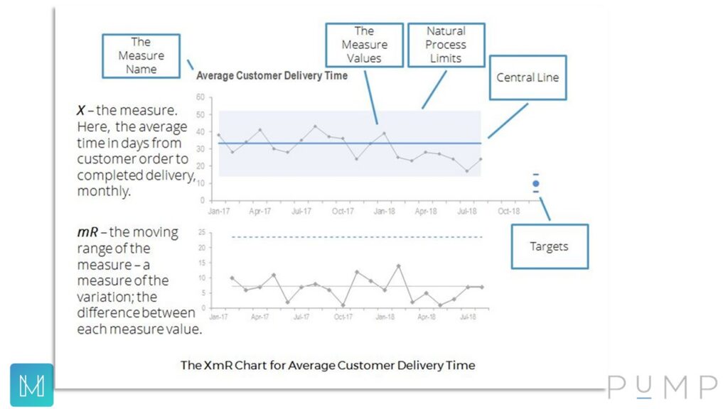
Because the status, activity and quota measures are usually counting activity and tracking the project spend (for example), the XmR chart won’t really be useful with those.
What XmR Charts do for us
XmR Charts take a systems and/or process perspective.
This allows us to see the trend over time, visually displaying how the systems and processes are performing. Are they stable, producing low levels of variation, or unstable, with broad levels of variation (displayed in the charts).
Help us move from point-to-point interpretations to observing the patterns of performance.
Once we can observe performance using the XmR charts, we can see the patterns over time, which measure values are within normal variation and which are not. This means can we stop doing a knee-jerk reaction. Just because this fortnight was higher than last fortnight, may not mean we need to react. Reacting to measure values within normal variation creates noise and waste within your business.
Monitor signals in our performance measures.
Using XmR charts there are essentially three key signals. Firstly, an outlier – a measure value that is outside the upper and lower process limits of natural variation. An outlier is unusual as it has fallen outside of the natural variation for this measure. Let’s have a quick look into what happened. Second signal, a short run. Here we have a three or four measure values in a row on one side of the central line. Shows there might have been a change, let’s verify and continue to monitor. Thirdly, a long run. Eight measure values in a row on one side of the central line. Evidence that the system/process has changed, recalculate the central line.
Observe valid trends.
Leaders and managers trying to explain a trend when there is no trend. Maybe they have an idea about what might have happened and therefore want to see a trend appear. However, using the XmR charts comes back to those three key signals. Perhaps “trend” is a weasel word..?
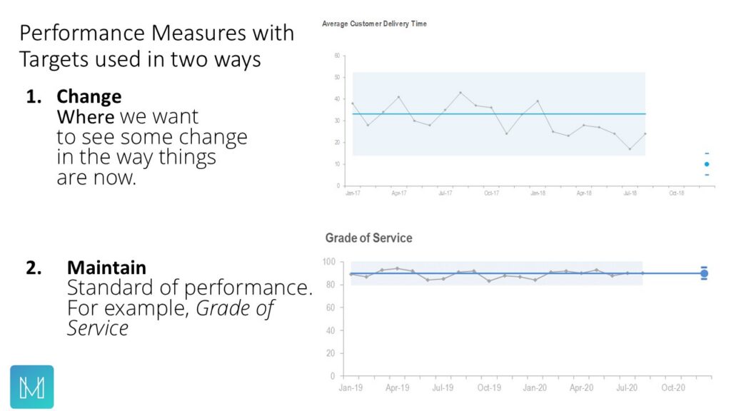
Help us set more meaningful targets.
We need five measure values to validly create an XmR chart. This will give us the central line and the upper and lower process limits. Once we know the central line and how much variation there, we can, if we choose to, add a target to (a) the central and/or (b) the upper and lower process limits. These targets are set in the future.
-
- We can set targets for improvement, as a focus point for an improvement team.
- Or we can set targets with the view of seeking to maintain this current standard of performance.
- And, not all performance measures, need targets. Perhaps we just want to monitor some performance measures to see how they track over time.
This article on the PuMP Academy site provides a detailed dive into these tools (XmRs, with reporting tips).
Let’s move forward
Use the right KPI tool for the right job. Using the right tools for the right task gives us better outcomes.
We have seen that there are four types or progress measures, but only one type that will provide feedback on the outcomes we seek, and they are performance measures. The status, quota and activity measures, literally just monitor activity or progress towards a predetermined milestone.
Once you are using the right tool – performance measures – to provide feedback on your results/outcomes, then use the proven tool of the XmR chart to monitor performance over time.
You can also use XmR charts to set targets for improvement, either by focusing on shifting the central line – and/or – reducing variation (targets on the upper/lower process limits).
Use the right KPI tool for the right job.
Are your KPIs used for the right job..?
Two key articles on this topic:
Eight Steps to a High Performance Organisation
Attention Breakthrough Seekers
Mark is the PuMP Partner Australia and Asia-Pacific
Further related articles:
How To Close The Strategic Gap
Featured image by Zoe Richardson on Unsplash