Seems too many leaders and managers are using the NPS number (Net Promoter Score) as a target. As soon as you add a target to a measure, you will get unintended behavioural consequences that game the measure. That is not the goal or purpose of any measure. Especially true perhaps of NPS.
Let’s examine how NPS can provide a rich source of feedback on the results we seek.
Your NPS is produced by the experience your customers have as a result of all your systems, processes and service coming together. Poorly designed, clunky systems and processes will increase the effort for customers, and deliver an experience they are unlikely to recommend to others.
In this age of the customer it is critical that we build advocacy within our customer portfolios. Experience design is all about reducing the friction in the process, to make it easier for customers, which leads to greater levels of advocacy.
NPS as a measure
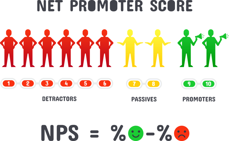
NPS is calculated by taking the percentage of customers who scored nine-or-ten, to the question, how likely are you to recommend our service/product to your friend, colleague or family on a scale of 0-to-10. Less the percentage of customers who scored zero-or-six. It is literally the net number of promoters (scored nine-or-ten) less those who are detractors (scored 0-6). See more here.
As your NPS is a performance measure of the likelihood that your customers will recommend you to others, you will first need to establish what the current natural variation is in your NPS measure.
Statistically this means you will need eight measure values. Then you can take the first five values and determine the mean of performance. This is your real NPS, the average of those values. Then look at the amount of variation in your measure values. This is not some subjectivity by your customers, but it is their perception of the varied experience they have, which produces varied scores in your measure.
This statistical approach is using XmR charts, as recommended by PuMP – the Performance Measurement Methodology (see more here). XmR charts have be the tool of choice by serious performance improvement practitioners for about 60 years (such as W. Edwards Deming and Donald Wheeler). XmR might sound a little like science fiction but: the X = the measure values chart. The mR part refers to the moving range, a measurement of the natural variation within the measure.
NPS and XmR
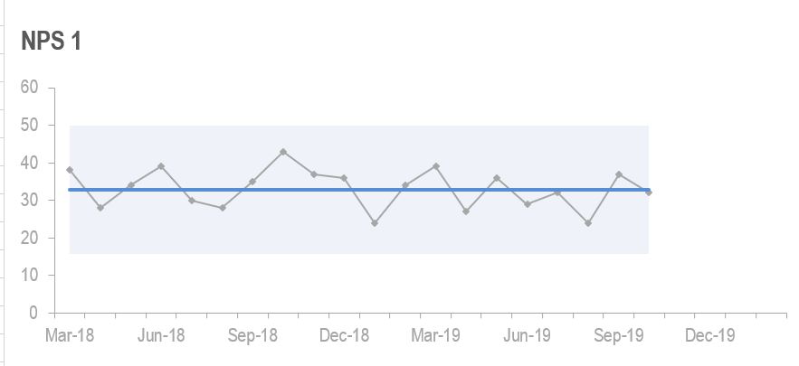
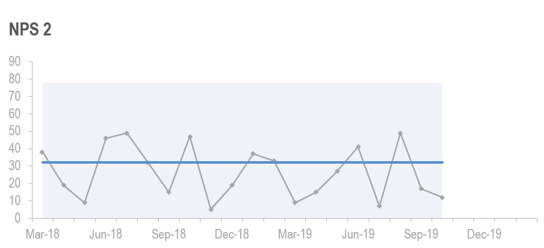
Consider the following two charts (the measure values charts only, not the mR charts) with an NPS measure, monthly.
The blue shaded area represents normal variation, that is, based on the data, the measure values within the shaded area are normal. What we expect from this data set.
The blue line is what we call the central line, an average of the first five values in that pattern of data.

This first chart shows that there is a fairly consistent level of performance with the NPS. This would indicate that the business here has disciplined processes, systems and people consistently delivering on their service promise. An improvement here could be to raise the central line, to a higher average NPS, and/or reduce the amount of natural variation.

This second chart shows a high level of variability. The process, systems and people are not consistently delivering value for the customers, to the point where they will consistently recommend.
Your NPS is your central line, the average of the first five values of the pattern of data. Not the number you got in the last survey.
In the two examples above, the NPS is the same. But the service and experience these customers have that drives the recommend score is not the same at all.
If you are tracking NPS in one big survey each year, you cannot rely on this as a meaningful piece of measurement, it is just one measure value, per year. You would be better off sampling your customer base and collecting the NPS measure value more frequently. In this way you can understand how consistently you are delivering service and experiences worth recommending.
Know what drives the number
We also need to look at how your NPS is calculated. What the numbers are that create the NPS.
Consider these three NPS scores for three different organisations.
| Detractors (0-6) | Passives (7-8) | Promoters (9-10) | NPS |
| 20 | 50 | 30 | 10 |
| 0 | 90 | 10 | 10 |
| 40 | 10 | 50 | 10 |
Whilst the NPS is the same for each business, the reality for the customers and each business is completely different.
The NPS is the same. But the story the data behind the score tells, is very different for each organisation.
Let’s look at the first row, with 20% Detractors, 50% Passives and 30% Promoters. Some of the key questions and challenges to any organisation with NPS spread like this:
- Who is promoting and why?
- What’s working with these customers?
- What is it about the value exchange that these customers love?
- What are we doing wrong with the Detractors?
- Did we acquire the wrong customers (Detractors) into our portfolio?
- What is wrong with the value exchange for Detractors?
- How do we engage with more passives? How do we identify the right passives to engage with?
Any NPS score should be sparking curiosity about your customers. Not all customers are equal. Your NPS (and subsequent analysis) can provide key insights into your customer portfolio.
Looking at the second row with 90% Passives and 10% Promoters. Let’s hope that those customers who are Promoters are the right ones. Those customers that we have chosen to get the optimal value exchange in place with. (Read more about the two-way value exchange here).
Looking at the third row – this organisation has customers that either love or hate them. Very little in between.
Can you imagine what it must be like in their customer contact centre? Can you imagine the additional costs of running this business with so many customers that are detractors?
Detractors will make you pay for poor service and experiences. They will also reduce the amount of new customers you can attract.
NPS is so much more than the number
NPS does so much more than give you a score of promoters over detractors. It can provide you with a health check for your customer portfolio.
Can also provide you with a lens to spark curiosity to find out more about what is happening within your customer portfolio.
May also provide clues that you are acquiring and keeping the right customers. And the amount of payoff you are getting from your efforts in customer experience design and the implementation of your customer strategy.
Strive for understanding and improvement. But never set a target/KPI on NPS that is attached to remuneration or bonuses. If you do you will inspire people to fiddle with the number or the system to give you the number you want. This is actually easier than getting genuine improvement.
In a recent Wall Street Journal article that describes NPS as a ‘dubious management fad‘, Fred Reichheld (co-creator of NPS) is quoted as saying: I am “astonished companies are using NPS to determine bonuses and as a performance indicator. That’s completely bogus. I had no idea how people would mess with the score behind it, to make it serve their selfish objectives.”
Concluding points
- Use NPS as a measure to provide feedback on your performance result: “Our customers are advocates of what we do”.
- Measure frequently to understand the natural variation in your NPS.
- Understand the numbers behind your, unique NPS.
- Get curious about the make-up of your customer portfolio and what your NPS is telling you about the implementation of your customer strategy.
- No performance bonuses attached to NPS.
- Reward curiosity, learning and continuous improvement.
You can learn more about the Profit by Design book here.


